Insert Joy Into Travel Planning
My Role: UX Researcher, UX/UI Designer
The Problem: World travelers struggle to plan itineraries for sightseeing, dining and shopping when traveling to foreign destinations.
The Solution: To design a mobile app that takes the pain out of planning travel for people who love to travel but who dislike planning itineraries.
The Tools: Miro, Otter.ai, Google Surveys, Figma, Adobe XD, UsabilityHub
Research Highlights
The UX research phase consisted of 3 main elements: A survey, interviews, and a competitive analysis.
The Survey & Interview Phases
A survey was sent out to travelers, ages 18+, who typically travel 3-4 weeks per year. The survey posed questions regarding their use of travel itineraries. The survey results indicated that when people travel their families, or in other groups, that they rely on an itinerary to keep the vacation on schedule and within their budgets.
From those surveyed six were chosen to participate in the interview process. The interviews occurred during the COVID-19 pandemic and took place over Zoom conference calls. While the surveys indicated that travel itineraries are extremely important to the overall success of a vacation the process of actually planning is painstaking and travelers feel overwhelmed of the task in creating an itinerary.
Competitive Analysis
The travel sector is a large player on-line and within any app store and thus the competition is heavy. Notwithstanding, there is still some potential opportunities for a new player in the market. Inspirock and Plannapple were picked for a SWOT analysis after they appeared in search results for the terms “trip planning” and “itinerary creation.”
Inspirock is a leading brand in the industry and within this analysis their solution leads over Plannaple. Their strength lies in a large database and established algorithm. However, they do lack a mobile app experience.
Planapple’s strongest solution is a widget that can be added to web browser. Their website is difficult to use whether on mobile device or desktop. But it is marketed as free and the experience feels more like freeware. Planapple also lacks a mobile app that can be found on any app store.
Certainly, this analysis could have included more of the competition but it still shows that there are opportunities within the market for an another mobile app that focuses on itinerary creation.
User Persona
Meet Barbara Johnson, my user persona for this case study. Barbara has her hands full with a full time job and family. Because of limited time, Barbara needs help to make the best of her travel plans so that she can focus on her family - the people she values most.
Travelers, just like Barbara, are stressed for time and don’t have the time to create the itineraries they need to keep them on schedule and maximize time spent at their destinations.
This problem raises the question, “how can travelers minimize the pains of travel planning so that they can focus on the things that matter the most and have an itinerary prepared for their travel?”
Prototyping & Design Phase
Sketches, User Flow
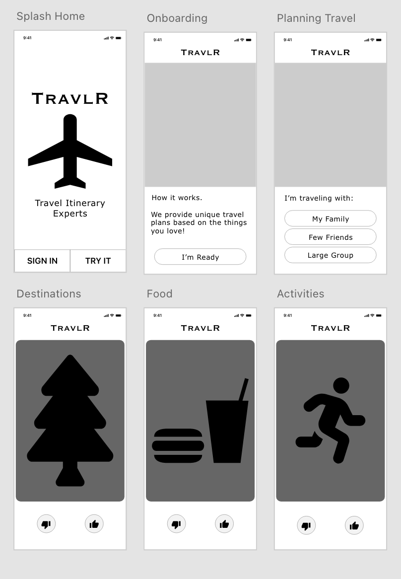
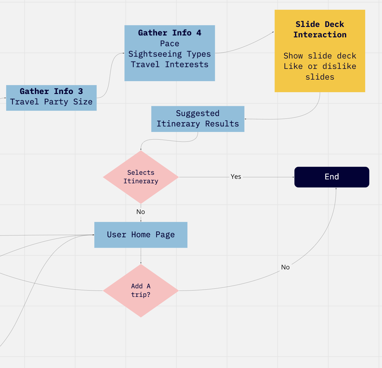
I began this phase by doing some sketching of possible onboarding and registration screens. Based on the sketches I also drafted a user flow sing a Miro board and converted the user flow into some LoFi wireframes using Figma.
Mid-Fi Prototyping
I moved the designing and prototyping from from Figma to Adobe XD and created another prototype. I made this switch simply because of individual preference to Adobe XD.
More spacing was added, changes to the coaching screens, and I added screens to my prototypes to capture the main function of the mobile app which is to show a series of cards to the users to like or dislike. The application uses this user input to narrow down the interests of the user and then offering a set of itineraries that meet their interests.
The user flow was also updated to include this function as it is the primary purpose of the app to make itinerary creation more enjoyable. I also updated the branding from Addicted2Travel to TravlR.
Hi-Fi Prototyping
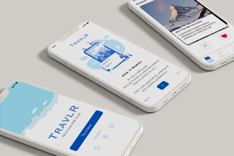
Spacing, typography, color scheme, and pictures were all added to the designs to finalize the prototype. A two rounds of usability testing were performed on the prototypes on UsabilityHub and adjustments to the screens were made based on the feedback. Those adjustments included added text to describe the photographs being displayed, and also swapped out the thumbs up and down icons to a heart icon and an X icon. After the adjustments were made and the 2nd round of usability testing confirmed that users were able to more accurately understand the purpose of the screens and application.
Key Takeaways
Some key takeaways from this project are:
Prototyping. It was during the prototyping stages of the design process that some ideas really started to come to light. In particular the idea to marry the concept of a dating app to a travel app.
Testing! Usability testing brought top light important aspects of the design that were not included in earlier prototypes. Re-testing the prototypes were able to confirm the omission solved usability issues.
User flows and sketching. In this case study sketching and creating user flows were crucial to shape the user experince.


